An Interview with Koby Levy, the Biennale’s graphic designer, about branding the Biennale, the graphic language of the exhibition, and the design of the bi-lingual catalog
The catalog design is part of the branding of the Biennale – a new event which will take place every two years at the museum – could you please describe the process?
The branding process included designing the overall identity of the Biennale as a recurrent event, as well as that of the current exhibition. It began with the collection and processing of information and of numerous materials – concerning the Biennale itself, the curatorial concept for this exhibition, and the physical space of the museum. This process involved a “round-table” dialogue with the museum and the exhibition’s administrative, marketing, content, design and curatorial teams.
The tight schedule and the extent of the exhibition required an intensive and rapid work process, and the quick processing of information into conceptual possibilities and design options. We chose to develop one concept in depth, so that it would encompass the range of relevant applications – from the wall texts and informational signs included in the exhibition itself to the multi-media marketing campaign and the catalog.
The Biennale logo is shaped in the form of a ligature, a single sign that combines the different forms of the letter B as it is written in Hebrew, Arabic and English – as an expression of the aspiration for a multicultural sphere. The use of three languages also recurs in the full title of the exhibition. The logo’s formal complexity, which resembles an illustration, is also related to the images found on coins and other objects in the museum’s permanent collection.


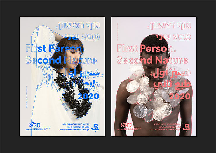
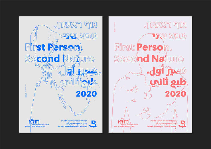
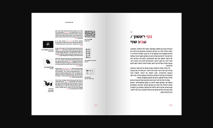
The visual envelope of an exhibition usually makes use of a single leading image that is hermetic, memorable and easily identifiable. Since the current exhibition encompasses over 250 works, we sought to distill a quintessential and memorable visual language, which would simultaneously allow us to use a range of images pertaining to the works. The curatorial theme First Person. Second Nature expresses the tension between physical concepts (natural/artificial, traditional/experimental, and so forth). The tracing of the photographed objects’ outlines became a central and easily identifiable component of the exhibition language, alongside the use of a range of images and a colorful, modular compositional and typographical code.

How does one approach the design of the catalog for a group exhibition including over 250 works?
The catalog also had to take into consideration the visual elements mentioned above. The underlying assumption was that the photographs of the works would appear in the catalogue in a neutral manner, without tracing, and that the expressions of the Biennale’s visual language would appear in other, less conspicuous ways – the preservation of the typographic code, the inclusion of the color red, which serves as the leading color in the overall graphic envelope and appears in the texts alongside the color black, the inclusion of tracing illustrations on the title pages of the different chapters, and so forth.
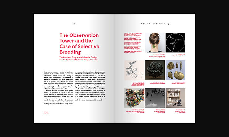
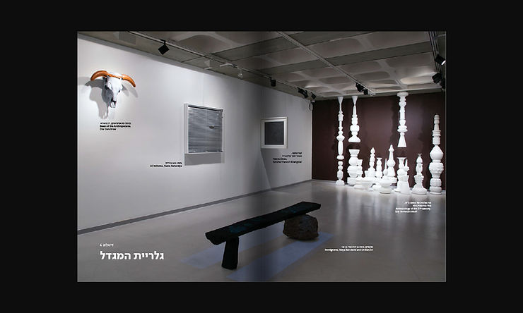
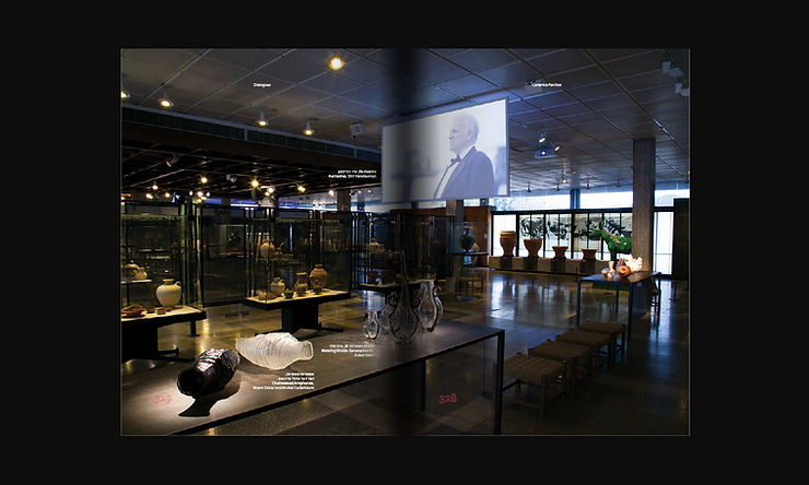
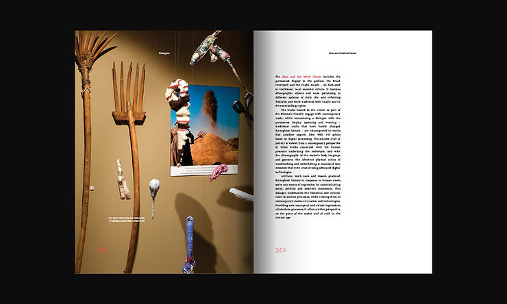
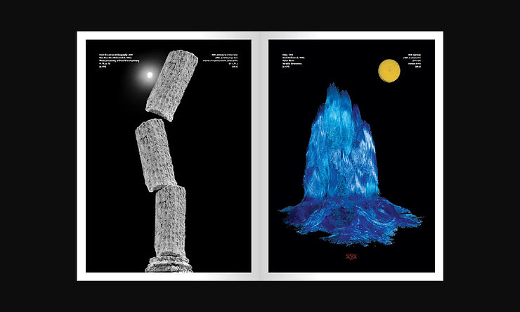
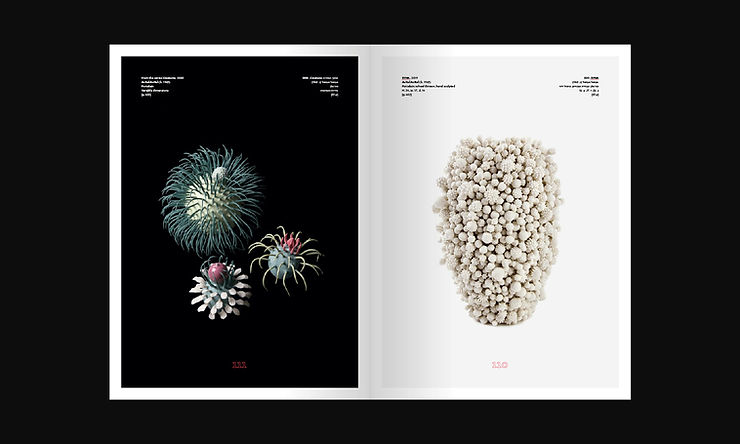
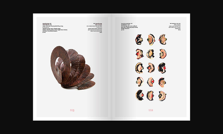
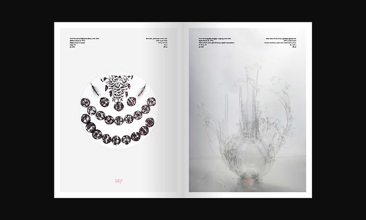
We defined several elements whose presence in the catalog was deemed essential – installation views of the many and different exhibition spaces that present the exhibition as a multilayered, multidimensional curatorial ensemble, and separate photographs of each individual works, so that their particular qualities can be appreciated.
Photographing the objects was a rapid and systematic process (using uniform lighting and a compositional arrangement appropriate for each work). Photographing the display spaces took place once the exhibition was mounted and the lighting was installed, so that the space could be understood in terms of scale, conceptual and formal relations, and so forth.
In what way are the exhibition’s thematic chapters given expression in the catalog?
The fundamental division was between the individual works, which were photographed separately (and each presented alongside an accompanying explanatory text), and the installation views. There were also internal divisions introduced into the two groups: the photographs of the works were divided according to five curatorial themes (Must/Need, First Person/Second Nature, You Are Here, Back to the Future, Heaven and Earth). The installation views were divided according to the spaces, since the body of works included in the Biennale entertained a different dialogue with each space, and in some cases also with the permanent displays.
Could you tell us a little bit about the arrangement of the works in the catalog – how did you select the pairs of works that are featured adjacent to one another, and what feeling did you seek to impart?
Once the overall structure of the book was consolidated, including the division into groups, we created and examined visual continuums of works – both within each spread and within each group, as well as among groups and different thematic units. At this point, the process relied somewhat on intuition and a search for pleasing or rewarding visual and conceptual associations that create new visual, conceptual, or narrative connections.
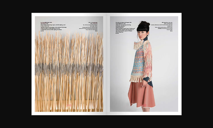
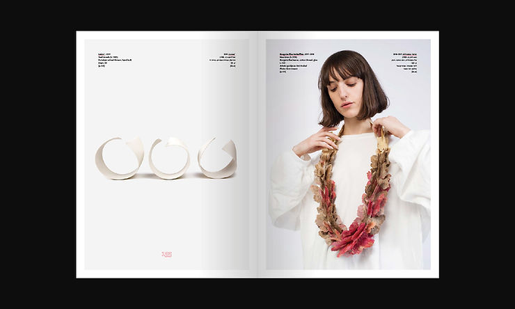
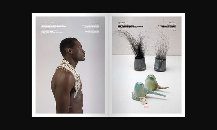
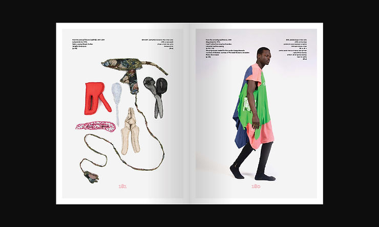
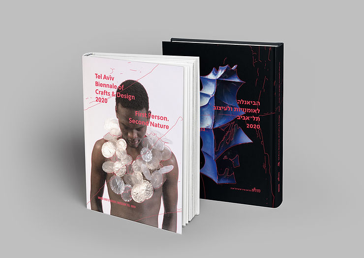
From a certain stage onward, it was difficult to separate the photographed object from the photograph. Each photograph became an object in and of itself, with its own use value for the campaign. One good example of this is that at the beginning of the process, we decided to photograph the wearable objects on actual people (who were not models). This series of photographs expresses a broad range of conceptual and visual ideas, which I believe is compatible with the breadth of the exhibition and with the curatorial theme and exhibition title – First Person. Second Nature. A connection between these different photographic modes is also evident on the cover of the exhibition catalogue: one side featured a work by Ofir Zmudjak, and the other side featured a work by Lital Goldenberg, worn by a human figure.
There were numerous works that captured our attention while we photographed them. In some cases, we made use of them in the advertising campaign – in newspaper advertisements, billboards, and so forth. We avoided the use of a single image, choosing instead images that reflected a wide visual and conceptual range, while enabling a combination of text, captions and tracing in a manner that is mutually enhancing yet legible.
Catalog
Chief Curators: Henrietta Eliezer Brunner, Yuval Saar
Associate curators: Nir Harmat, Merav Rahat, Liora Rosin
Catalogue design: The League (Koby Levy, Amit Menda-Levy)
Hebrew text editing: Tamar Shenkar
English translation: Talya Halkin
Photos: Hadar Saifan (unless otherwise noted)
Printing: A.R. Printing, Tel Aviv
English cover: From the series Between Me and Me, 2018, Lital Goldenberg, photo: Roni Cnaani
Hebrew cover: From the series Lanceolate, 2018, Ofir Zmudjak, photo: Hadar Saifan
To purchase the catalog, please enter the MUZA shop
More Articles

New Acquisitions: Gifts from the Tennenbaum Collection to the Glass Pavillion Over 70 glass items from the Rivka and Zvi Tennenbaum Collection have been donated to the Glass Pavilion in memory of their son, the flute player Yadin Tennenbaum, who was killed at the Suez Canal in the Yom Kippur War
18.04.24
New Acquisitions: Works Exhibited at the Biennale of Crafts & Design Some 60 artists whose works were exhibited at the Biennale of Crafts & Design held at the museum in 2020 and 2023 generously contributed their works to the collection of MUZA, Eretz Israel Museum, Tel Aviv
18.04.24
International Conference: DAY 1 – movies and lectures
24.01.22